Problem Statement
As a fully self-driving car (electric) driver/passenger, I want my driving/riding experience to be mindful, efficient, and enjoyable so that I can feel safe and in control while I’m riding.
Research
Goal - Motivation - Current user behavior
Different scenarios of the driving experience,
Scenario 1 - User experiences driving by a voice-controlled assistant.
Scenario 2 - First experience of a user with touch only (screen) control system of the car.
Scenario 3 - Listen to music or watch videos while enjoying the ride.
Based on few assumptions and identified persona, empathy mapping provided some insights to map out certain considerations.
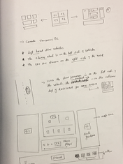
Notes & Scribbles

User Interface
Font
SF Pro Text
Light, Regular and Semi-Bold
Clear and readable text is crucial for the design. I used SF Pro Text as it is designed for legibility.


Moodboard

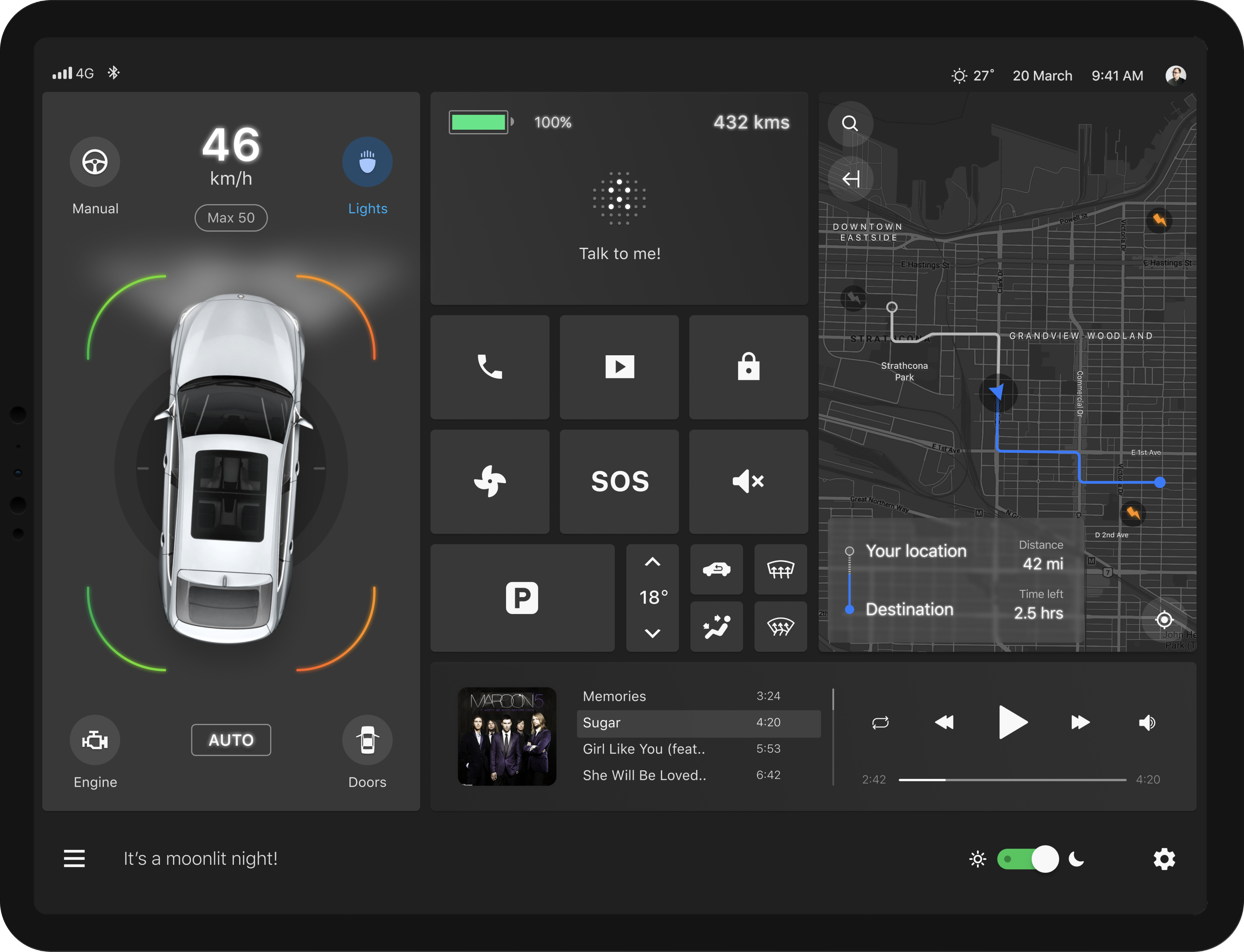
Left - CAR STATUS
-
In Canada, driving is on the right side of the road and the steering wheel is on the left. The vehicle status and control is placed on the left of the dashboard as the high-priority information can be easily referred.
-
Design is sleek and minimal for less distraction.
-
Digital text-based speedometer is clear and loud enough for quick reference.
-
Car model and vehicle state is clearly shown so that the user is always aware of the situation.
-
Manual to Auto and lights ON/OFF is evident and placed with relevance.
-
The circles under the car represents the car mapping the surroundings (research findings).
-
Proximity warnings are clearly shown around the car - red/orange for close proximities and green for safe zones.
-
AUTO mode shows what driving mode the car is in currently.
Center - CONTROL CENTER
-
Control center - the second priority information is placed right in the center.
-
Voice assistant is right at the top and center where user can start conversing.
-
Total kilometers covered and the power left for the vehicle is placed with needed importance but can be quickly noticed.
-
Each icon is used to represent the exact purpose for an action by the user. Very straightforward.
-
Based on the research, parking and emergency (SOS - for medical or personal emergencies) are placed as prioritized by the user.
-
On tap of SOS user will be asked to opt for nearest hospital or call for help (Police or friend) with current location sharing options.
Right - NAVIGATION
-
Map is clean and only relevant information is shown. User has the freedom to view more options on expansion of the map.
-
User can quickly learn how much time and distance is left to reach the destination.
-
Small thunderbolts represent the charging points for the car and faded thunderbolts are out of range for the car.
Music Player
-
Minimal theme. User can view current playing album/playlist , select songs and play.
-
On tap of the album cover, user will be able to see his/her full collection.
-
Tap on sound icon can bring the full screen volume control.
The Process
While the requirement was to design screens for an in-car interface for a fully self-driving electric vehicle, my approach was to study and understand what problem does the design solves, and how does it solve a user problem.
In order to do that, my approach was as follows based on few assumptions.
-
The objective - Identify the problem which the design will solve.
-
Define the problem for which I am designing the solution.
-
Once the problem is identified and well defined it’s time for ideation.
-
Once I’m convinced with my direction, the next steps were quick low-fidelity wireframes and jump to Figma for the UI designs.
The objective while designing the experience is to make sure the driver/passenger of a fully self-driving car (with a manual driving option) reaches his or her desired destination as smoothly as possible.
-
Discover the pain points of the user while riding a fully self-driving car.
-
Understand and analyze user concerns, desires, and tasks which will help me identify the core problem.

-
An in-car touch interface for a fully self-driving electric vehicle.
-
Driver or passenger can use this interface to monitor the vehicle's statistics, adjust climate control, play music, engage route guidance, etc.
-
Simple and easy-to-use interface.
-
Good usability, appropriate aesthetics, tone, and touch paradigms.
IN-CAR TOUCH INTERFACE
AUTONOMOUS CARS

Empathy Maps
Takeaways,
-
The user feels safe when they are in complete control. Continuous feedback, both visual and with motion, the user completely feels safe and comfortable.
-
How will the user feel safe and in control? - The interface should help user receive enough but constant feedback in order to build that confidence both visually and while they interact through UI. Clear navigation across screens, accessibility, relevant information and straight forward actions are very key for the user to feel he or she is in complete control.
-
Physical components inside the car are almost none for the user.
-
Less screens and quick navigation is very important for accessibility.
After synthesizing the pains and gains and assumed scenarios, it’s ideation time.


